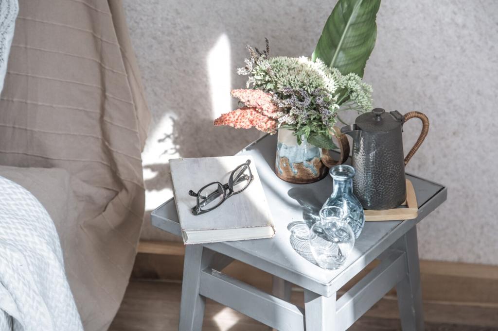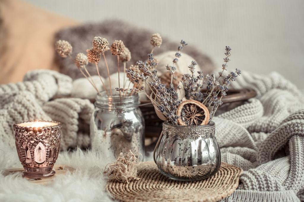
Building a Muted Palette: Undertones That Matter
Start by sampling against floors, countertops, and large furniture. If your oak skews honey warm, pair it with gentle beige or putty tones. Cooler stone prefers foggy gray or limestone white. Post a photo and ask the community which undertone they see first.
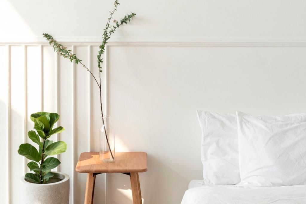
Building a Muted Palette: Undertones That Matter
Choose a quiet base color for walls, a slightly deeper support tone for trim or built-ins, and a whisper accent for textiles. Keeping all three muted maintains cohesion while adding dimension. Try it, then share your trio in the comments for feedback.